The Skeptic's Guide to Low-Fidelity Prototyping
Designer Paul Rand once said, “An understanding of man’s intrinsic needs, and of the necessity to search for a climate in which those needs could be realized, is fundamental to the education of the designer.” Prototyping helps us to unveil and explore these human needs, opening the door to insightful interaction and more empathetic design solutions.
Low-fidelity prototypes, in particular, are rough representations of concepts that help us to validate those concepts early on in the design process. Throughout this article, we will look at some of the features that make low-fidelity prototyping a unique tool to radically improve your work and to build an environment in which users’ needs can be truly realized.
This article focuses on the practice and general principles behind integrating low-fidelity prototypes in design in general, covering applications that range from graphic, web and user experience (UX) design to business and service design.
What Is Low-Fidelity Prototyping And Why Will It Improve The Way You Work?
Have you ever spent an overwhelming amount of time and resources designing something that a client or user discards in a matter of seconds? I’ve seen it happen far too many times. It is never pleasant, always frustrating, yet often preventable. Designing a product without continual validation is like walking blindfolded over a plank into a sea of sharks. Even Apple, a company that has repeatedly spoken against using focus groups to design products, pioneered a process called the Apple new product process (ANPP), which involves creating and testing hundreds of early prototypes.
Some of us are quick to jump into building (what to us seem like) brilliant products, to the point of pixel perfection, without even stopping to ask whether our user or client feels the same way. The fact is that designing without introducing potential users to raw versions of our ideas is unsafe, uncomfortable and wasteful.
On the other hand, perfection can also haunt some of us to the point of inaction. While some are too quick to act and end up wasting resources, others are completely paralyzed by the “excessive” amount of work behind building something new. There’s just “so much to get done” before delivering the product to the user that we end up feeling frustrated and overwhelmed.
Have you ever overspent resources in a rush or accomplished too little for being a perfectionist? Low-fidelity prototyping helps us to find the middle ground between overspending and overthinking, between too little investment and too much user validation. By building a practical, preliminary version of your product, you will catch potential problems and promising insights faster and earlier in the process.
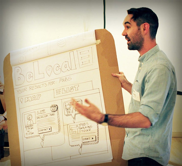
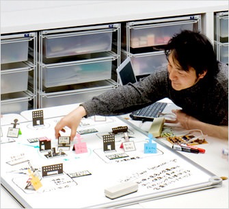
UX designer Matt Tyas presents a prototype concept.
The word “prototype” comes from the Greek prototypos, a compound of protos (“first”) and typos (“mold,” “pattern,” “impression”). This initial, raw presentation of our ideas is precisely what we’ve come to know as low-fidelity prototyping. Unlike high-fidelity prototyping, this method requires less time, specialized skills and resources. Its purpose is not to impress users, but to learn from them. Instead of wowing people with our product, the goal of low-fidelity prototyping is to have users wow us with their insight. In a way, the technique facilitates listening, rather than selling. It opens a conversation in which users’ needs, designers’ intentions and other stakeholders’ goals are discussed and aligned.
Scientist Jim Rudd and his colleagues at IBM helped to define the difference between the two major types of prototypes in a much recommended piece titled “Low vs. High Fidelity Prototyping Debate” in Interactions Magazine:
Low-fidelity prototypes are generally limited function, limited interaction prototyping efforts. They are constructed to depict concepts, design alternatives, and screen layouts… These prototypes are created to communicate, educate, and inform.
“Fidelity” can be a confusing term. In broad terms, it can be defined (according to Oxford Dictionary) as “the degree of exactness with which something is reproduced.” In other words, a prototype’s level of fidelity answers the question, How precisely does this represent the final solution?
Why Now?
Though low-fidelity prototyping has existed for centuries, it has recently become popular with the spread of agile design methodologies, inspired by several movements:
- Design thinking advocates for “thinking with your hands” as a way to build empathetic solutions.
- Lean startup relies on early validation and the development of a minimum viable product to iterate on.
- User-centered design calls for a collaborative design process where users deliver continual feedback based on their reactions to a product’s prototype.
As pointed out, we can’t really say that low-fidelity prototyping is new because people have been laying out concepts on cavern walls since time immemorial. What we can say is that, given the speed with which we are expected to design market-appropriate solutions, low-fidelity prototyping has never been more important to all kinds of designers.

Designers in companies such as Nintendo use low-fidelity prototyping. Designer Kazuyuki Motoyama explains that the only way to actually know what a Miiverse would feel like was to hold it. That’s when he built this prototype out of cardboard. (Image credit: Nintendo)
Advantages
All low-fidelity prototypes, regardless of the type of product being built, bring the following advantages.
Detect and Fix Major Problems Early
Building a low-fidelity prototype that can be quickly exposed to user feedback enables us to visualize and solve core issues related to the product’s usability and proposed functionality. Because the prototype is not supposed to generate insight about the final look and feel of the product (they are rough approximations), users generally submit thoughtful ideas from what they see. By removing the bells and whistles associated with high-fidelity prototypes, we strip our concept down to the core. Addressing whatever problems we detect at this stage is vital to the product’s eventual success.
Consultant Nigel Heaton wrote a key paper titled “What’s Wrong With the User Interface? How Rapid Prototyping Can Help,” presenting it at the 1992 IEE Colloquium on Software Prototyping and Evolutionary Development. He explains that rapid prototyping should be able to solve around 80% of all major interface issues. In the process of designing products that truly match users’ needs, low-fidelity prototyping provides a much-needed wake-up call right from the start.
Aside from helping us to detect major problems, low-fidelity prototyping also gives us the motivation required to fix them. In a 2012 study of the psychological experience of prototyping, researchers at Stanford and Northwestern University found that “the practice of low-fidelity prototyping… led to reframing failure as an opportunity for learning, fostering a sense of forward progress, and strengthening beliefs about creative ability.” The study concluded that building low-fidelity prototyping affects not only the final product, but our level of engagement with the design process itself.
Build Cheaply and Easily
Low-fidelity prototypes can be easily built by individuals and teams with little or no technical skills. As long as the goals of the product and project are clear, then the emphasis with low-fidelity prototyping will be not on form or function, but on focus. Where should we invest our resources next? Where should we avoid investing them? Which features will be key for the user? Are we headed in the right direction with this raw concept? Do we need to pivot towards new models or explore other options?
The best low-fidelity prototypes are built resourcefully, on a small or nonexistent budget and in a short time period. You may also be familiar with the term “rapid prototyping,” which is merely the practice of “quickly mocking up the future state of a system.” In the spectrum of rapid prototyping, low-fidelity prototypes are on the speedy end.
Draw Feedback that Focuses on High-level Concepts, Rather than Execution
In his article “Prototyping for Tiny Fingers,” interaction designer Marc Rettig points to the imminent risk of working with high-fidelity prototypes, which is that you will likely “hear criticisms about your choice of fonts, color combinations, and button sizes.” Being exposed to an elaborate prototype, users might feel compelled to comment on these details and neglect to gather their thoughts on high-level concepts such as user flow, layout and language.
Rather than being focused on validating the product’s underlying assumptions and core value, high-fidelity prototypes redirect attention towards the aesthetics of the product. A rougher low-fidelity prototype, on the other hand, “forces users to think about content rather than appearance.”
Iterate More Willingly
Because the effort and resources required to produce a low-fidelity prototype are significantly less, we are less reluctant to change the prototype completely. Think about it: When has it been easier for you to completely scrap something you’ve been working on? When you’ve invested a few minutes sketching it or when you’ve spent countless hours perfecting a prototype? In Rettig’s words, “Spend enough time crafting something and you are likely to fall in love with it.”
Iteration is key in a truly agile design process. Only by continually evolving our concepts will we be able to create empathetic solutions that will succeed in the current market. Low-fidelity prototypes encourage this type of shameless, stress-free environment of iteration. Making sharp changes, pivoting to a new business model or even starting from scratch feels more natural to us because there is simply not that much to scrap.
Carry and Show Them Easily
While some high-fidelity prototypes require a special device or environment to be shown, most low-fidelity prototypes can be easily carried around and shared. Rudd states, “Low-fidelity prototypes are easily portable — they can be presented on paper, view graphs, or white boards.”
How hard is it to transport a piece of paper? Does it require any special conditions, spaces or advanced instructions? Paper-based low-fidelity prototypes liberate us from the burden of technical and portability requirements.
If you decide to build a low-fidelity prototype using any of the software listed at the end of this article, then reconsider whether showing it on a screen is the best choice. A study showed that paper encourages collaborative work more readily than screens in several interesting ways. Researchers at the University of Nottingham, University of Surrey and Cambridge EuroParc examined how paper and screens foster collaboration in three different work settings: an architectural practice, a medical center and the control room in London’s underground railway. They concluded that paper generates an added flexibility that enables individuals to interact and collaborate in a wide range of ways.
The researchers noticed, among other things, that by handwriting (i.e. drawing, writing or sketching low-fidelity prototypes), participants were able to take notes quickly, while remaining engaged with subjects. This flexibility is particularly important when designing collaboratively and communicating with users to obtain feedback. The natural versatility of paper (it can be folded, cut, scribbled on) also made cooperation significantly easier. Consider these advantages when you decide to expose users to a low-fidelity prototype. Printing out your screenshots or wireframes could radically change the input that you receive.
Types
Paper-based 2D
It doesn’t get any simpler than a plain old sheet of paper. Marc Rettig estimates that paper-based prototyping frees designers to spend 95% of their time thinking about the design itself and to spend only 5% on technical issues (which he calls the “mechanics of the tool”). Reflect on your own experience: How many times has your attention diverted from the essential elements of design to the technicalities of a tool?
In web design, for instance, paper-based low-fidelity prototypes can include screenshots of interface elements. In his article “Using Paper Prototypes in Home Page Design,” former Sunsoft engineer Jakob Nielsen suggests that “Pop-up menus, messages, and dialog boxes can be simulated with Post-it stickers, or transparent overlays printed on overhead foils.” Sunsoft’s experience with redesigning its home page revealed that primitive, rough prototypes are valuable sources of insight into usability.
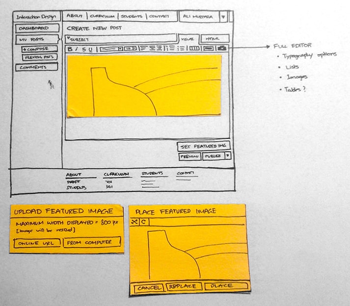
This low-fidelity prototype of a new web design for SCAD’s Interaction Design department shows the initial concepts for improving reading and posting interactions.
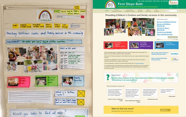
The team at Flow New Media Design shows how it starts with paper-based prototypes to “strip things back to the bare bones [and] concentrate on the important things.”
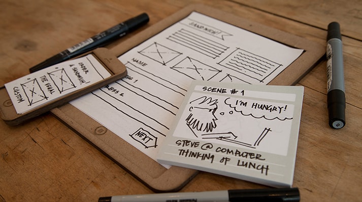
Two interaction design students launched a company named Sticky Jots, which offers kits to help anyone get started with low-fidelity paper-based prototypes, such as storyboards.
3D
If you want to get more creative and provide users with a 3D prototype to interact with, several fascinating options are available. Using cardboard, foam, wood, plastic, clay and building blocks has become increasingly popular, especially with the spread of design thinking’s hands-on approach.
3D prototypes add a level of interaction that 2D prototypes do not achieve. While building it might take slightly longer, a 3D prototype encourages manipulation and could draw a higher level of engagement in the concept-testing phase. The three-dimensional nature will add realism and open the door to valuable feedback.
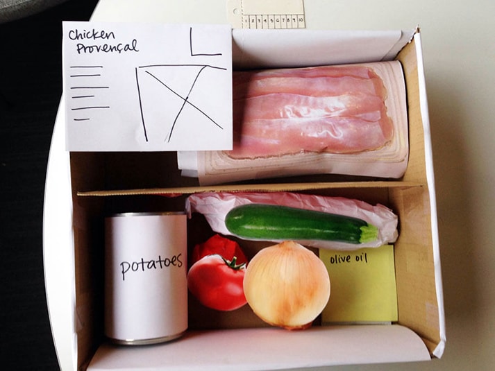
Ashley Costanzo developed this 3D low-fidelity prototype for HealthyMade: fresh ingredients and recipes packaged into a healthy preplanned meal. This product answers the question, “How might we provide healthier food options to people in need?”
Business origami is a paper prototyping method developed by Hitachi to facilitate the design of services and systems. It was developed in-house but eventually attracted the attention of other organizations. The paper cut-outs of various objects improve prototyping systems and interactions with them.
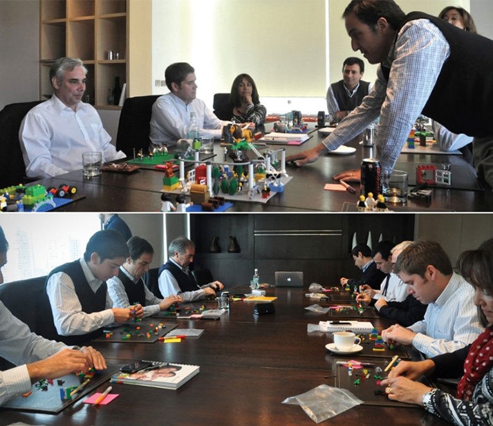
LEGO Serious Play was created to facilitate innovation and business performance. The sets can be used to build low-fidelity prototypes of business and service experiences. Liquid Agency, for instance, used this method to prototype an answer to the question, “What type of health care do we aspire to offer that would make a difference today and tomorrow?”
Quick Start Guide
1. Define Your Goals: What Will You Show?
Which main features do you want to expose your users to? List two to three pieces of core functionality that you will include in the low-fidelity prototype. In the next step, we will make sure that these aren’t left out.
You can use a simple table like the one below to list your features:
Core features | Complementary features
|
Sample features to prototype in graphic, web and UX design |
Sample features to prototype in business and service design |
|
|
Here are some sample features that you might include as either core or complementary:
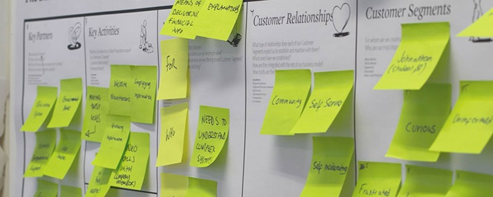
Business model canvas. (Image credit: Aberdeen Global Service Jam)
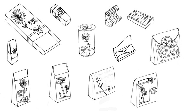
Concept development and sketches for flower seed packaging. (Image credit: Shavonne Maclin)
2. Define the Method: How Will You Show It?
Decide what kind of low-fidelity prototype would suit your project best. What could you build quickly that would help users to deliver valuable feedback? How could you display and test the concept simply, investing the least amount of resources? To find the simplest method possible, continue asking the question, “Is there a simpler way to show this?” until you arrive at a feasible way to depict the product’s features.
The level of detail that is right for your prototype will depend on a few factors:
- What type of user will be exposed to this prototype?
- Would they be able to deliver insightful feedback based on the model that you are presenting? Would they need to see a certain level of detail in order to understand the concept?
- What resources are accessible to you?
- With low-fidelity prototyping, agility is crucial. Think of the tools and resources that surround you as you ideate. Be resourceful and find clever ways to use what you have.
Think about it in this way:
|
What I want to show |
Is there a simpler way to show this? |
Is there a simpler way to show this? |
Is there a simpler way to show this? |
|
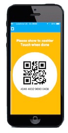
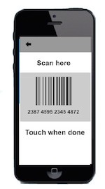
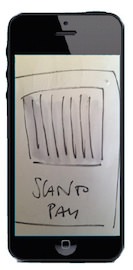
Inputting a QR code |
|||
|
Geolocation feature (for browsing nearby) |
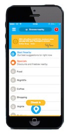
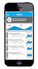
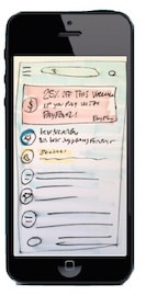
Note: The prototypes above show the evolution of the design of the payment screen in Foursquare’s existing app and were designed by Marta Fioni.
Still struggling to find a method that suits your project? Here are some ideas:

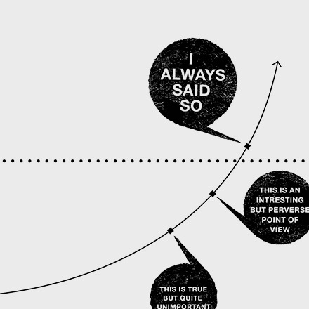
Download this graphic and hang it somewhere visible in your office. It will keep you motivated to make low-fidelity prototyping a consistent part of your design process. (Download Tabloid version, PDF, 383KB)
3. Execute: Show It
Start out by defeating your “My skill in [x] isn’t good enough” mindset. Low-fidelity prototyping is not about how sophisticated your model looks, but about the conversation it generates about the future of the product. Remember, not form or function, but focus.
Sample Low-fidelity Prototypes from Different Design Fields:
|
Graphic, web and UX design |
Business and service design |
|
|
Try any of the following digital and analog tools to speed up your prototyping process:
|
Graphic, web and UX design |
Business and service design |
|
|
Digital |
|
|
|
Analog |
|
|
4. Test: How Will You Evaluate What You’re Showing?
Go beyond the idea that “It’s so rough-looking that users will hate it.” Having to explain the limitations of your low-fidelity prototype is normal. In fact, it is expected. Guide users to understand the aims of the project, and ask probing questions. If it helps, prepare a short guide before you present the prototype. List a few of the questions that you’d like to be answered during the session, and write an introduction that you could read out loud to help the user contextualize what they are looking at. These are some of the types of questions you will want to ask:
- Regarding perceived benefits
- “What, in your opinion, is the key benefit offered by this product concept?” “From the features you have seen today, which ones would make you use the product?” “Which features didn’t you see that would make you want to use it?”
- Regarding positive and negative reactions
- “On a scale of one to five, how much do you like this concept?” “Why?”
- Regarding awareness
- “Having looked at this concept today, what do you remember most about it?” “What do you recall?”
- Regarding comparative advantage
- (If you showed users two or more versions of a concept, ask which variant works best.) “Which of these options appeals to you the most?”
- Regarding emotional reactions
- “How did looking at this concept make you feel?” (Help them by providing a list of emotions — happy, frustrated, angry, excited, bored, etc. — or face illustrations that depict these emotions. Have each user select one or more emotions triggered by the prototype.)
- Regarding intention of use
- “Having looked at this product concept today, on a scale of one to five, how much would you be willing to use it once it has been refined and launched?” “Why?”
- General feedback
- “Feel free to annotate any changes or corrections that you feel would improve this concept.”
5. Learn: We’ve Shown. Now What?
Collect your users’ feedback and find similarities in their evaluations of the concept. Build an affinity diagram to identify the most common suggestions. Incorporate their feedback, and move on to building a high-fidelity prototype that reflects the product’s look and feel with a greater level of detail. Repeat the testing session with as many users as needed.
Conclusion
Hopefully, this article has helped you understand the impact that low-fidelity prototypes can have on our design processes and outcomes. The five steps outlined above are meant to guide you through the process of building and testing a low-fidelity prototype, and they will surely improve the quality and depth of your design work. Think about the concepts that you are currently working on: How could you validate them before investing an overwhelming amount of time and effort into polishing them? It isn’t always easy to see that a raw representation of what you are building might just be the right amount of fidelity needed to ask the most crucial questions about its effectiveness. When in doubt about whether you’re ready to test an early concept, always keep author Elizabeth Gilbert’s words close to heart:
Part of the elasticity that you need, in order to continue to try to create, is the foregone conclusion that not all of it is going to be fabulously successful. But it’s all going to be part of a long lifetime body of experimentation.
Other Resources:
- “50 Free UI and Web Design Wireframing Kits, Resources and Source Files,” Paul Andrew
- “Free Printable Sketching, Wireframing and Note-Taking PDF Templates,” Paul Andrew
- “Design Better and Faster With Rapid Prototyping,” Lyndon Cerejo
References:
- “The Psychological Experience of Prototyping” (PDF), Elizabeth Gerber and Maureen Carroll, Design Studies, 33:1 (2012), pages 64–84
- “Tasks-in-Interaction: Paper and Screen Based Documentation in Collaborative Activity,” Paul Luff, Christian Heath and David Greatbatch, Proceedings of the 1992 ACM Conference on Computer-Supported Cooperative Work, (New York, NY), pages 163–170
- “Chapter 10: People and Prototypes,” Bill Moggridge, Designing Interactions, Cambridge, MA: MIT Press (2007), pages 682–723
- “Using Paper Prototypes in Home-Page Design,” Jakob Nielsen, IEEE Software, 12:4 (1995), pages 88–89,97
- “Prototyping for Tiny Fingers,” Marc Rettig, Communications of the ACM, 37:4 (1994), pages 21–27
- “Low vs. High-Fidelity Prototyping Debate,” James Rudd, Interactions, 3:1 (1996), pages 76–85
